How to Read a Trail Map: Symbols, Scale, and Markers Explained
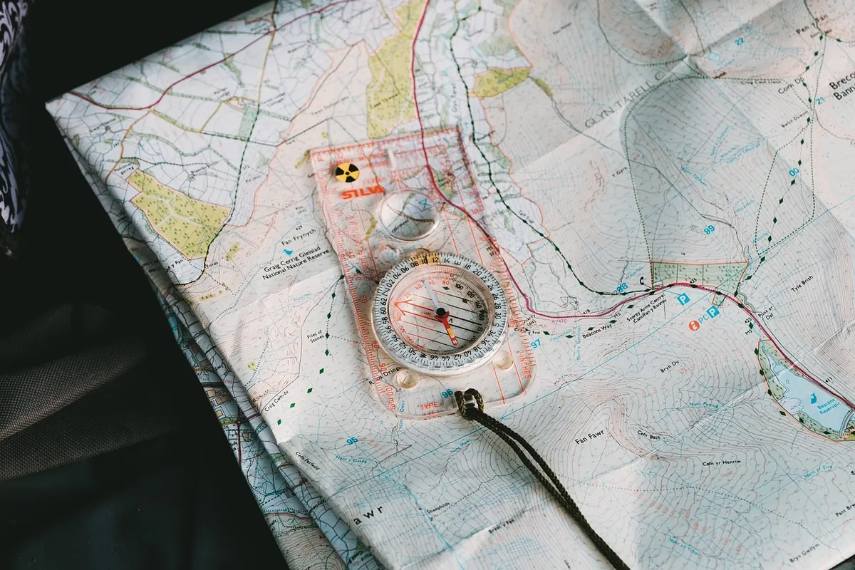
A trail map is not a picture of a place. It is a set of instructions, drawn in a private shorthand that only becomes obvious once someone shows you the key. The first time you hold one at a trailhead, the whole thing can look like a weather system: brown worms, green patches, black dashes, tiny numbers scattered like dropped pins. Twenty minutes later, with the same map, you can point at a ridge and say, "We climb for an hour and a half, hit the junction after the second stream, and the hut is on the far side of that saddle."
That shift is what this guide is for. Not route-finding in the heroic sense, just the ordinary craft of turning marks on paper into decisions about where to walk, how long it will take, and when to turn around.
Read the title block before the terrain
Beginners usually jump straight to the coloured part. Don't. The small print in the corner tells you whether the map is worth trusting. Look for four things: the area covered, the publisher, the edition date, and the scale. A park authority map and a national topographic survey can show the same mountain very differently — the park version usually has better trail detail and facilities, the survey usually has better landform. If you can, carry the one that matches your purpose and accept its blind spots.
The edition date matters more than most people expect. Tracks get rerouted after landslides, forest roads appear, a footbridge is condemned and removed. A map that is fifteen years old is not useless, but treat every line with mild suspicion and believe the ground over the paper when they disagree. Photographing the map at the trailhead also gives you a backup if the wind takes it.
Symbols: the legend is doing more work than you think
Every map carries a legend, and every legend is slightly different. A solid black line might mean a paved road on one sheet and a good gravel track on another. Never assume; read the key once at the start of the day, then read it again when you are unsure. The general grammar of topographical maps is fairly consistent, though.
Roads and tracks are solid or double lines. Footpaths are dashed. Dotted or broken-dotted lines usually mean an intermittent or faint path — often one that exists on the ground but isn't maintained. A dashed line crossing contour lines at a sharp angle is telling you something specific: steep ground, possibly with steps or exposure. Water runs in blue. Contours are brown. Buildings and huts are small black shapes, and a hut with a roof symbol is very different from a ruin.
Some symbols deserve a deliberate hunt before you set off:
- Water sources. Springs and fountains are often marked as seasonal. In late summer, "seasonal" frequently means dry. Carry more than the map suggests.
- Crossings. Bridges, footbridges and fords are drawn differently for good reason. A ford after rain is a decision, not a formality.
- Boundaries and closures. Park edges, private land, hunting reserves and seasonal restrictions often appear as fine lines or hatching that are easy to overlook.
- Bail-out points. Any path leading down to a road or a village is an escape hatch. Mark two before you start walking.
Scale: turning centimetres into hours
Scale is a ratio, and the arithmetic is simple once you've done it twice. At 1:25,000, one centimetre on the paper equals 250 metres on the ground, so four centimetres is a kilometre. At 1:50,000, one centimetre is 500 metres, and two centimetres make a kilometre. Most walking maps in Italy sit at one of those two scales, and the difference is not cosmetic: a 1:50,000 sheet covers four times the area but shows noticeably less detail.
Then comes the correction everyone forgets. Map distance is not walking distance. A path that measures two kilometres in a straight line on the paper might be three kilometres of switchbacks, stone steps and a detour around a washed-out section. Add roughly a fifth to a quarter for gentle terrain, and more on rough ground. If a route looks tight on the map, it will feel tighter underfoot.
For time, most walkers start with a rough rule of thumb: allow about an hour per four kilometres on the flat, then add an hour for every 600 metres of climbing. A fit adult with a light pack on a good path will beat that comfortably; a family with a picnic, a heavy pack, or a rough descent will not. Treat it as a starting point, then adjust for your own pace using a route you already know.
Pacing yourself with the map
If you want a more personal number, count your steps over 100 metres on flat ground early in the day. Two minutes of counting gives you a conversion that works for the rest of the walk, and it's far more reliable than guessing.
Elevation cues: what contours are saying
Contour lines are the part of the map that most beginners skip and most experienced walkers read first. Each line joins points of equal height. The legend states the contour interval — commonly 10, 20 or 25 metres — and every fifth line is usually heavier and labelled with its elevation.
The spacing is the message. Lines packed tightly together mean steep ground; lines far apart mean gentle slopes. Where contours form a V or U shape, the point of the V aims uphill into a valley or gully; where the shape points downhill, you're looking at a spur or ridge. A line that stops dead and restarts on the other side of a gap usually indicates a cliff or a very steep step.
Contours won't tell you everything. They don't show scree, loose rock, exposure or the difference between an easy grassy ridge and a scramble. What they do show is effort, and effort is what you plan around. A route with 900 metres of ascent deserves a different start time and a different lunch plan than one with 300.
Route markers and blazes: matching paint to paper
On the ground, marked trails are usually painted. In Italy the classic marking is a red and white blaze — often two horizontal rectangles — with the trail number painted on rocks, trees and posts, and wooden signposts at junctions giving destinations and walking times. That number is the handshake between the map and the mountain. Find it on the post, find the same number on your map, and you know you're on the right line.
Blazes fade, and fresh paint can appear on routes your map doesn't show. Flagging tape is usually temporary and sometimes unofficial. So use marks as confirmation, not as your only source of truth: check the blaze, then check the map, then check the terrain. At every junction, stop. Read the post, match the number, confirm the direction and the stated time, and take a photo of the sign.
If you lose the marks, don't keep walking in hope. Stop, turn around, and return to the last place where paint and paper agreed. It's almost always closer than it feels.
A ten-minute routine at the trailhead
- Fold the map so the day's route is visible without unfolding the whole sheet.
- Mark four points in pencil or with a finger: the start, the highest point, the key junction, and the finish.
- Name three features you cannot miss — a bridge, a hut, a saddle — and write them down.
- Identify two bail-out points where you could drop to a road or village.
- Read the forecast, then ask someone local about water and recent closures.
- Set a turnaround time, not just a destination. Write it on the map.
- Keep the map in a waterproof case, and your phone charged as a backup rather than a plan.
Do that once and the map stops being decoration. It becomes the thing that tells you the climb ahead is short and sharp, that the stream at the halfway point is seasonal, and that you have ninety minutes of daylight more than you thought. Paper and paint, read together, are still the most reliable navigation tool on the hill — worth learning properly, and worth carrying even when your phone says otherwise.
Photo: StockSnap / Pixabay